.svg)
.avif)
.avif)
Context
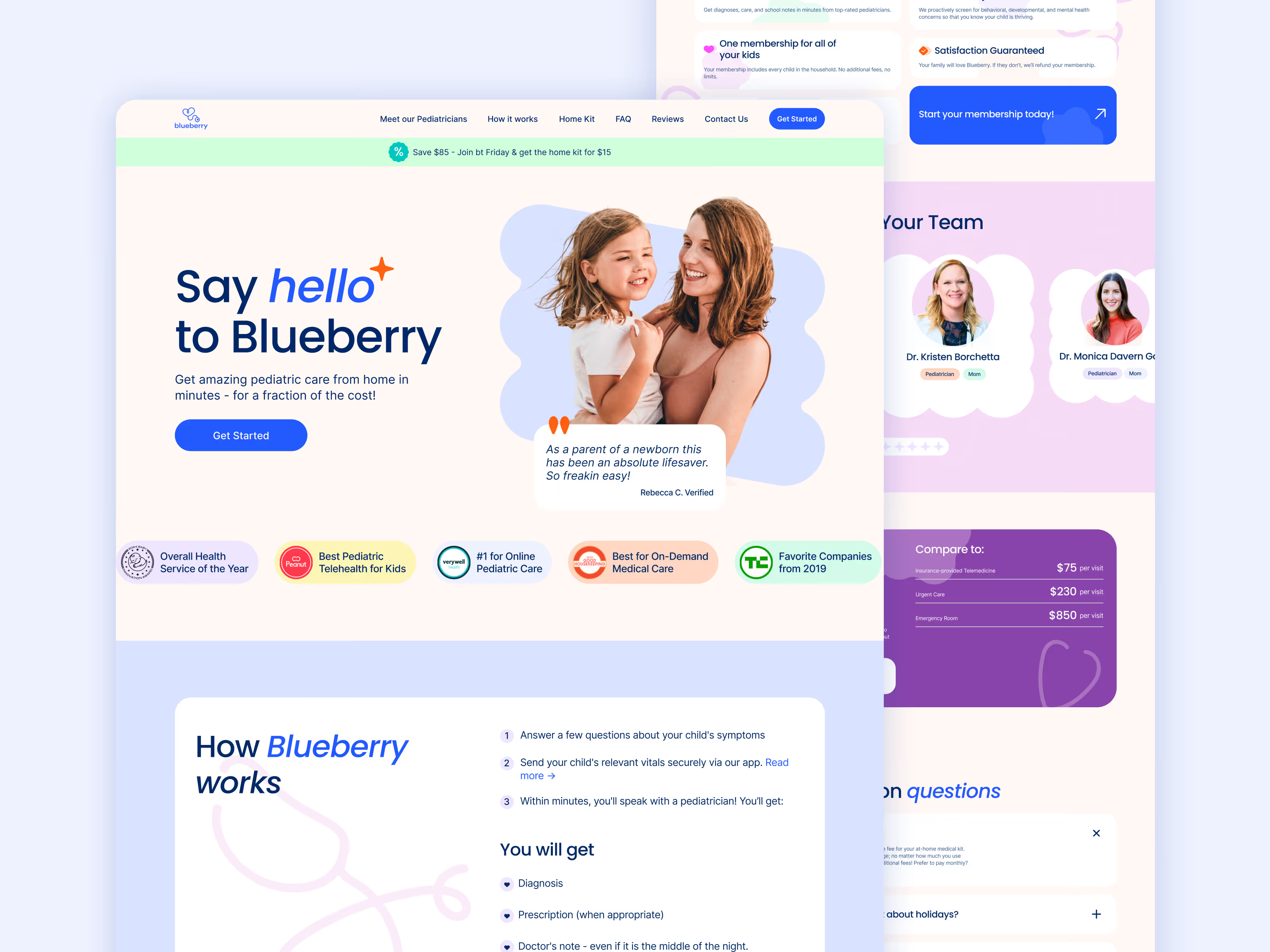
Blueberry Pediatrics is a fast-moving scaleup. The site needed improvements that could ship under pressure and work on mobile, where stressed parents make quick decisions.
What was happening
The website felt like a hospital: cold blue/white design, weak mobile readability, and visuals that didn’t communicate “caring, modern telemedicine.” On mobile, the blog was also hard to read, which increased drop-offs.
Date | June 2025