Webflow AEO: The future of AEO is now in the hands of webflow
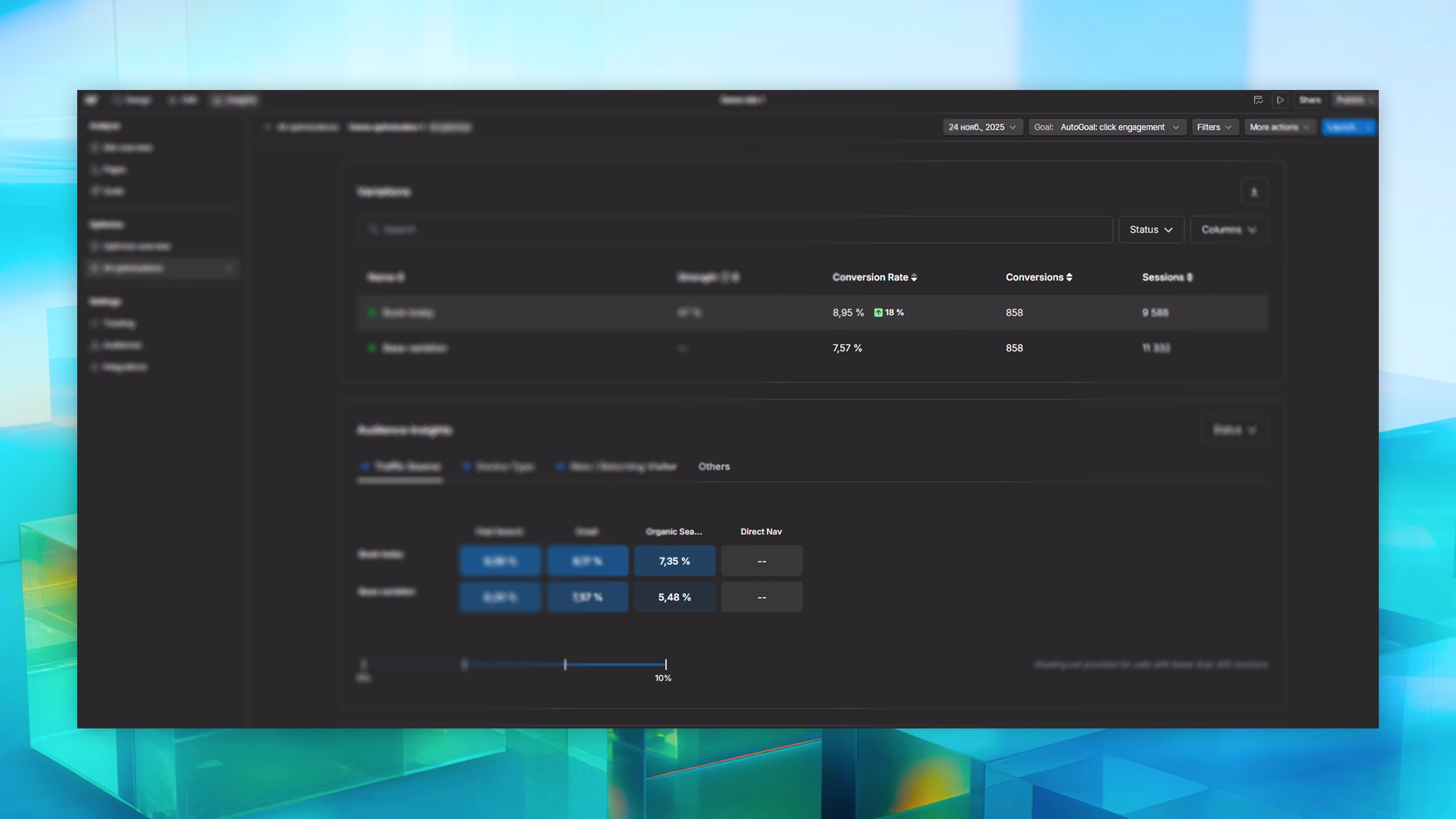
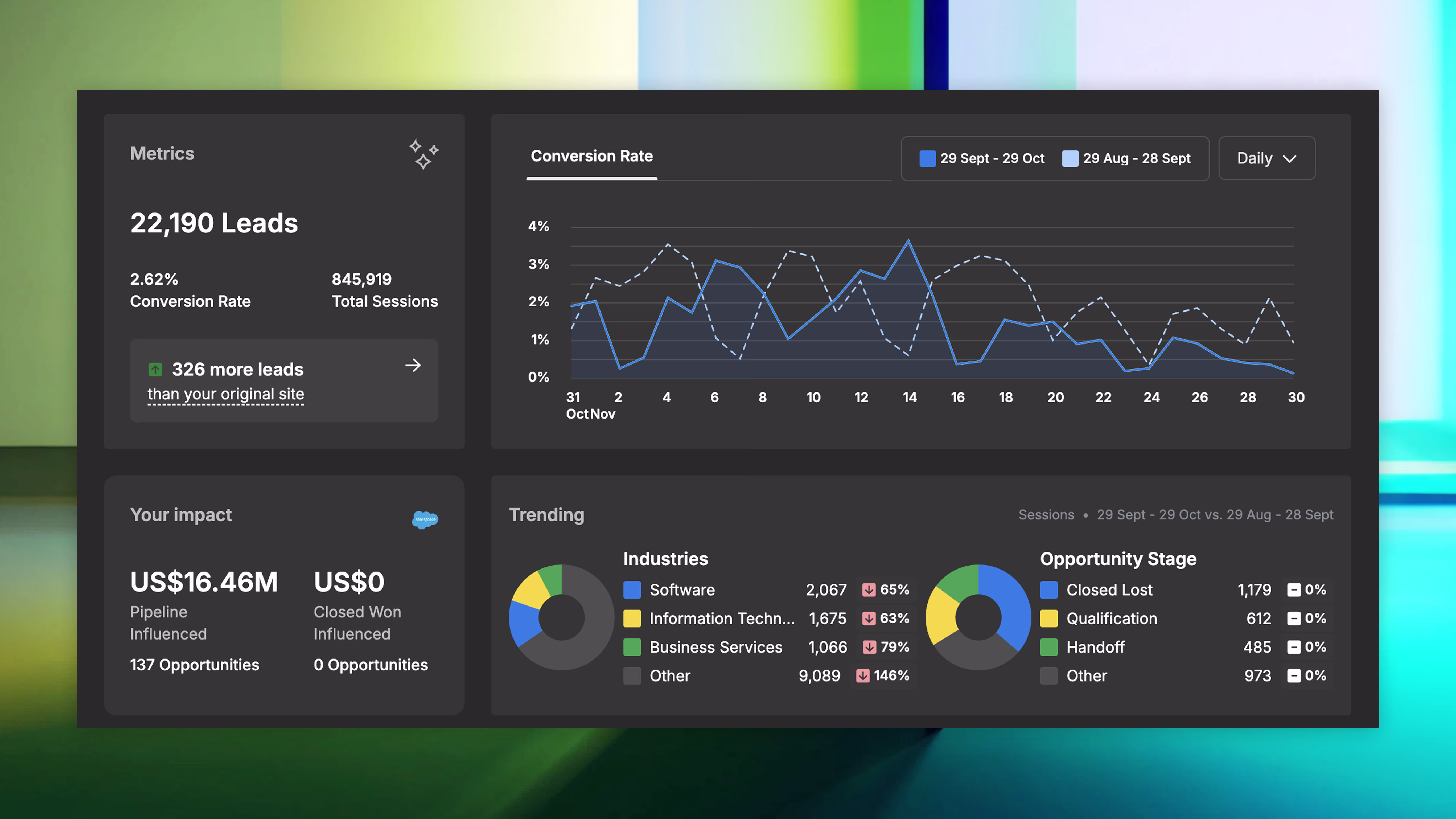
The rise of AI search, which synthesizes answers and reduces organic click-through rates by up to 35%, necessitates a shift from traditional SEO to **Answer Engine Optimization (AEO)**, a mission-critical strategy focused on becoming the definitive source cited by AI tools like Google AI and ChatGPT. To help marketers navigate this "seismic shift," the **Webflow AEO Maturity Model** provides an actionable framework structured across four core categories—Content, Technical, Authority, and Measurement—each detailing five levels of organizational maturity. This model guides the AEO journey by focusing on Content (moving from keywords to personalized question clusters), Technical Excellence (building high-performing sites with clean, LLM-ready code), Building Authority (earning trust through thought leadership and widespread positive mentions), and Performance Measurement (using real-time analytics). Ultimately, the goal of adopting Webflow's platform and the AEO model is to strategically position the brand so that AI is *telling its story* based on optimized content, rather than writing the story *for* it, thereby accelerating digital performance in the AI-first search landscape.
.svg)


.avif)

.avif)
.avif)


.jpg)
.jpg)


.avif)


.avif)


