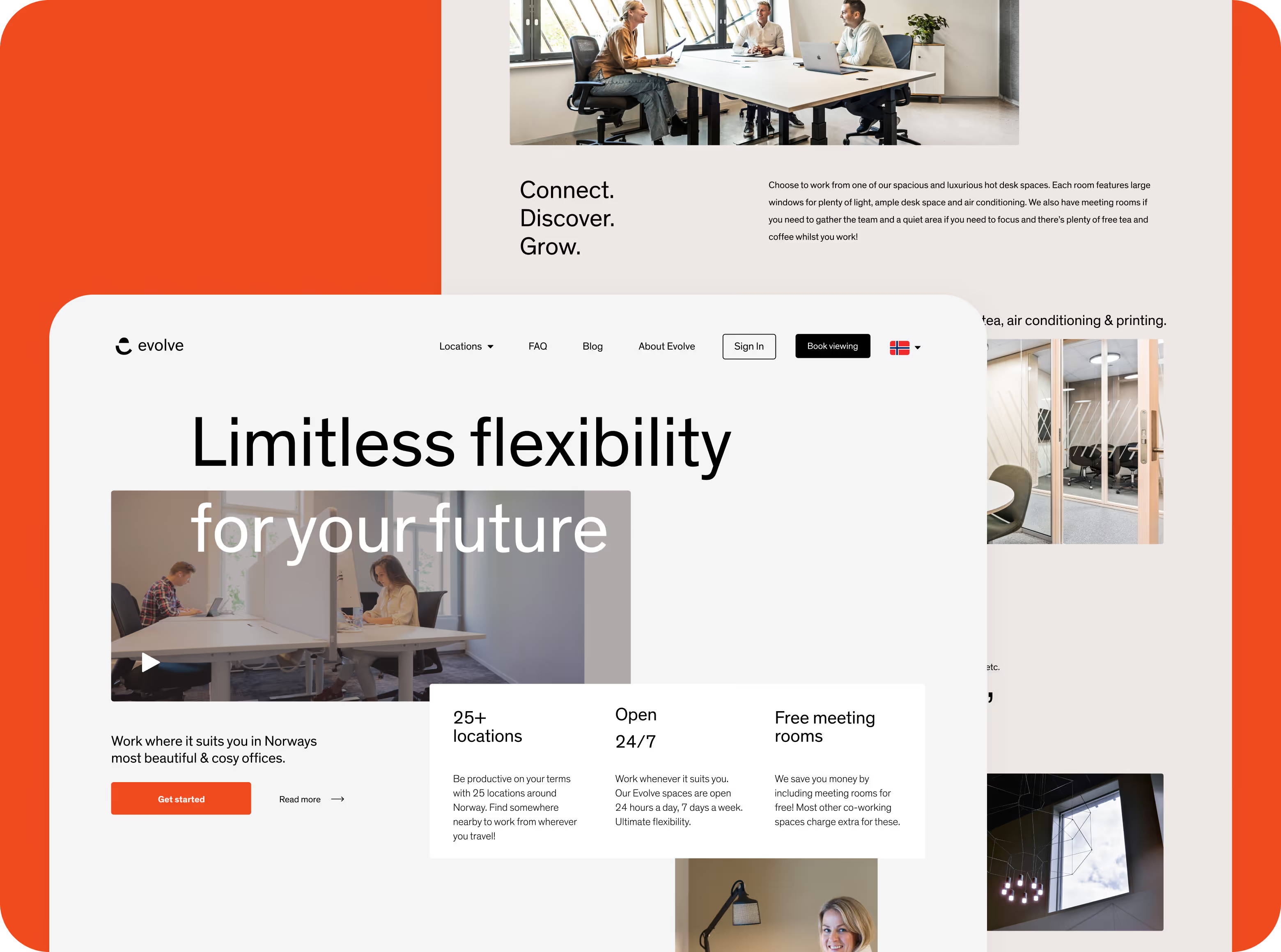
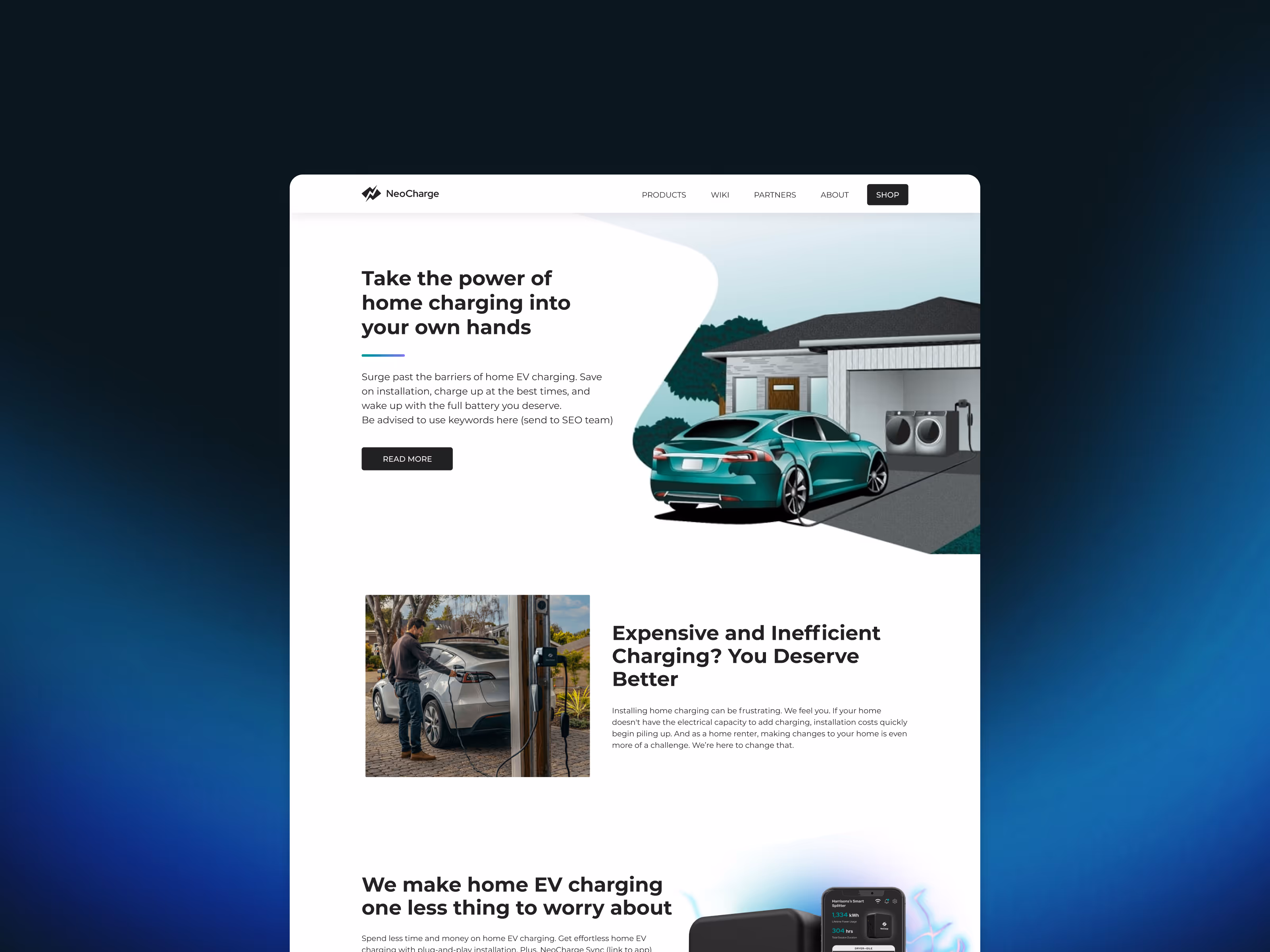
NeoCharge
about project

What we changed
Site architecture
Rebuilt the site flow: homepage educates on how the product works, product page sells benefits, a single Resources page consolidates all guides and FAQs.
Simplified navigation into a natural path: learn, evaluate, buy.
Checkout experience
Redesigned the product/checkout page with essential information surfaced upfront and a shorter purchase flow.
Removed drop-off points between "add to cart" and "complete purchase."
Visual design + mobile
Modernized the look from dated car-reseller aesthetic to clean consumer tech.
Built mobile-first with Lottie animations demonstrating product use cases.
Optimized page load to under 1 second.
.avif)
How we measured
Window: 6 weeks post-launch vs. 6 weeks pre-launch
Primary metrics: ecommerce conversion rate, monthly revenue
Secondary metrics: bounce rate, organic search traffic
Why it worked
Clear product storytelling replaced confusion. Visitors understood what NeoCharge does within seconds of landing.
Simplified checkout removed the gap between intent and purchase. Fewer steps, better information, less abandonment.
Structure matched the buyer journey: educate first, sell second. The old site tried both at once and did neither.
Mobile optimization meant the majority of visitors on phones actually had a usable experience.
more case studies
Learn more

.avif)