.svg)

Let's learn how to create this simple yet impressive text changing animation in Webflow.
We will be using a library called typed.js for this animation. Don't worry, no coding skills are required to make this work! Webflow project that allows adding custom code is all we will need.
To get this animation working, let's follow these steps:
Creating text block to animate
My plan with this animation is to have a sentence starting with "We are experts in " and then the following phrases being typed in and out: ''web design", "marketing", "SEO", "e-commerce". You can, of course, make it say whatever you like. Styling is also completely up to you.
First, we need to add some text element that will contain our sentence. I used a heading, but you can also use a text block, paragraph, quote, or any text element. We add the static part of the sentence in.

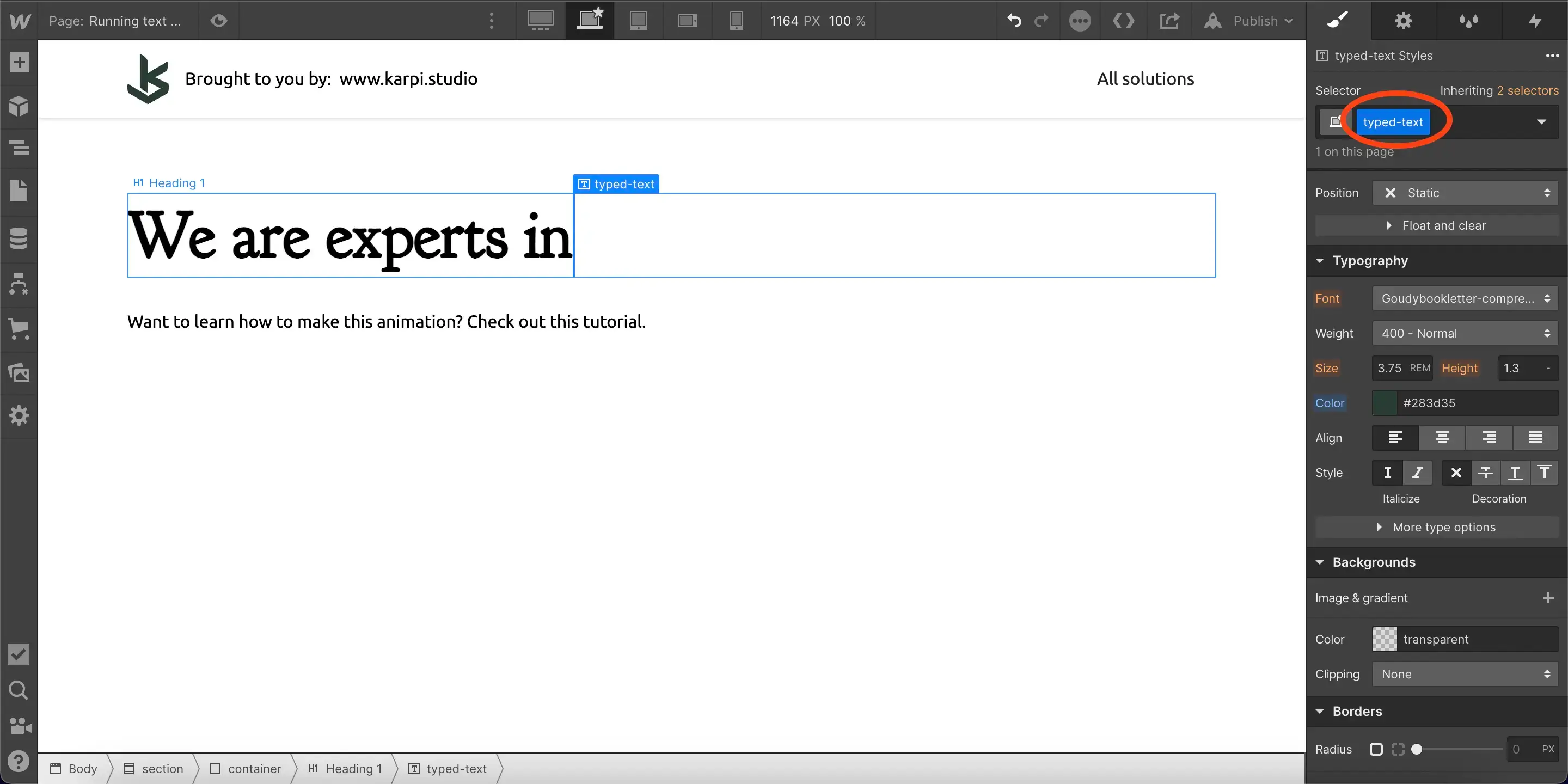
Adding text span
Next, we need to create a text span within this heading, where the changing text will be displayed. To do that, first add a space at the end of this text block.

Then, select this space. You can do so either using your mouse, or, with the cursor blinking at the end, hold shift and press left arrow key once.
Click on the "Wrap with Span" option that will pop up above the selection.
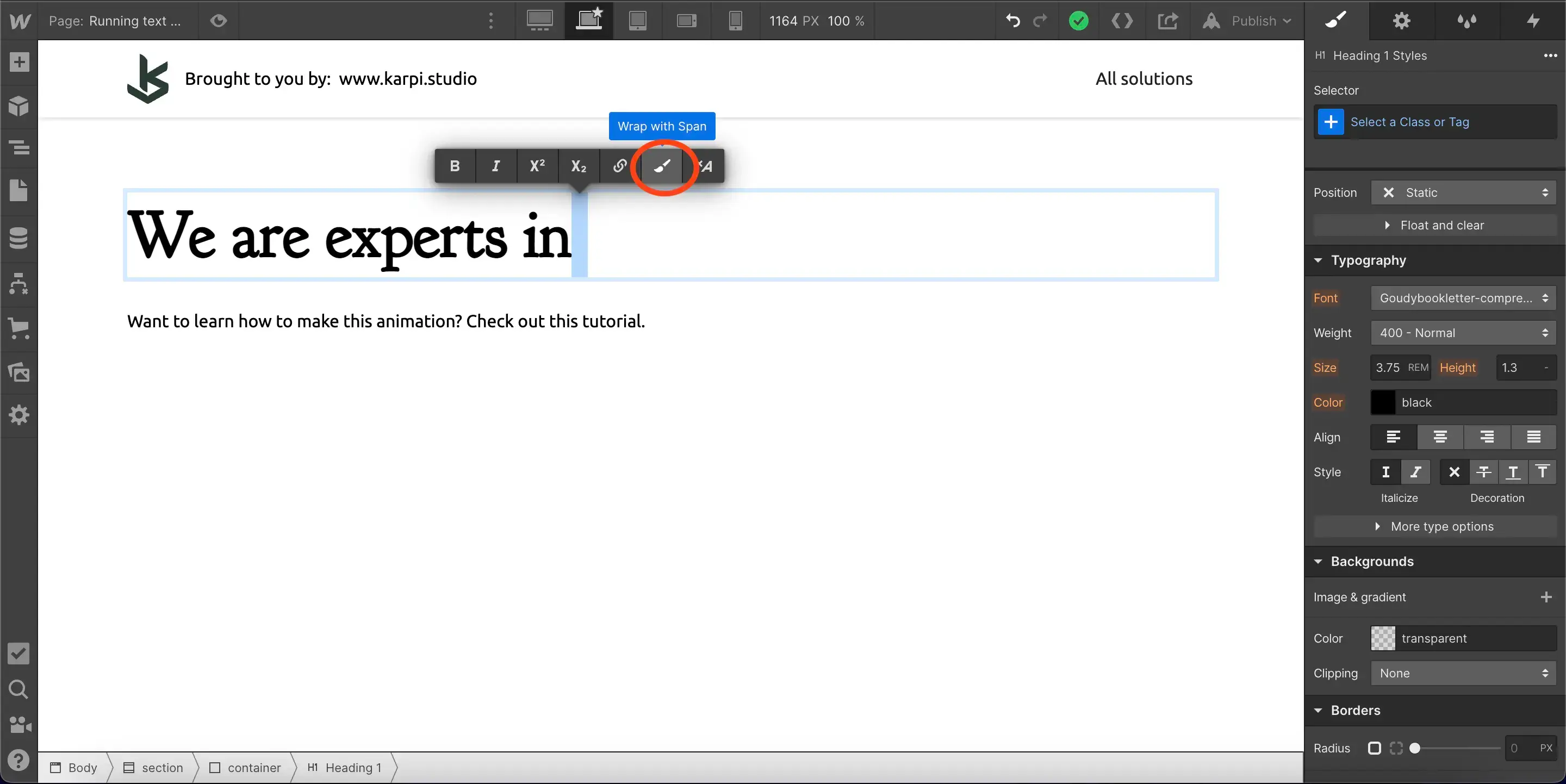
Put a class called typed-text on this text span, just like you can see below. Feel free to style this span differently than the parent text if you want.
Adding space between static text and span
This text span is where the changing text will be displayed. Right now, our sentence has no space between the last word and the text span. However, if you try to add it, it will not work. That is because HTML does not allow multiple spaces in a row. and we already have one space in the text span.
Thankfully, an easy solution is to add a hard space, instead of 'regular' space. To do so, press space while holding shift. That will create a non-breaking space.
Custom code
Next, we need to paste the following code into the page's before </body> tag:
This is where the magic happens. Let's very quickly go over this code.
The first part import the typed.js library into our project. Then, in 4th line, is where our phrases are. You can edit them to you liking, and have however many you'd like. Just always make sure to wrap your phrase in apostrophe, and add commas between them, just like you see in the example code snippet. Also always leave the first one empty, to prevent possible bugs. It won't intervene with the animation.
Then, from the 6th line, are different settings for this animation. Just to name a few, you can set what character to use as a cursor (wrapped in ' ' again), start and end delays, looping, and much more. I found these specific settings working and looking well. However, you can play around yourself using the typed.js documentation if you want even more options.
And with that, we are done! Remember that this animation will only work on published site, not in Webflow's preview.
You can find live example of this animation here, read-only available here.
Happy no-coding!
More Webflow build tutorials: add a CSS glitch effect and responsive vertical text.
.avif)